01/27/2025 20:07 Public
Number 13 - GM to the UTC+10 time zone of the Sydney! This is a mixed media piece I created using Copic markers, a ruler, and a protractor (flashback to high school geometry!). #nostrartstrJan2025 #artchallenge #art #artstr #mixedmediaart #rustypuppyart #gm #nostronly
01/27/2025 16:07 Public
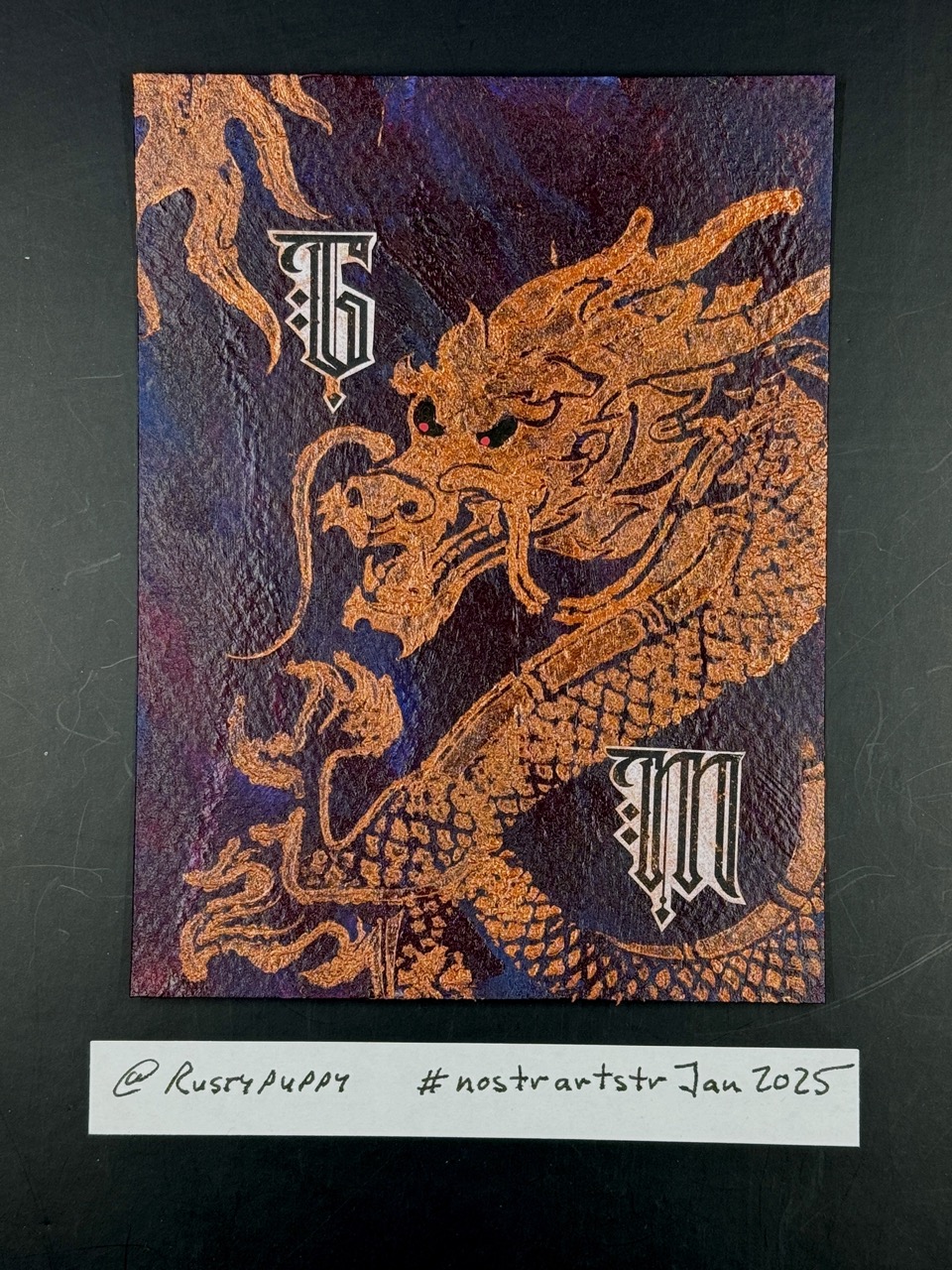
Number 11 - GM to the UTC-8 time zone of Vancouver! This is a mixed media piece I created using regular and metallic acrylic ink, Posca pen, and a stencil. #nostrartstrJan2025 #artchallenge #art #artstr #mixedmediaart #rustypuppyart #gm #nostronly
01/27/2025 13:07 Public
Number 10 - GM to the UTC-6 time zone of Chicago! This is a mixed media piece I created using the newsprint underpaper I use to cover my art desk, Posca pen, acrylic paint, acrylic ink and archival stamp ink. #nostrartstrJan2025 #artchallenge #art #artstr #mixedmediaart #rustypuppyart #gm #nostronly
01/27/2025 12:07 Public
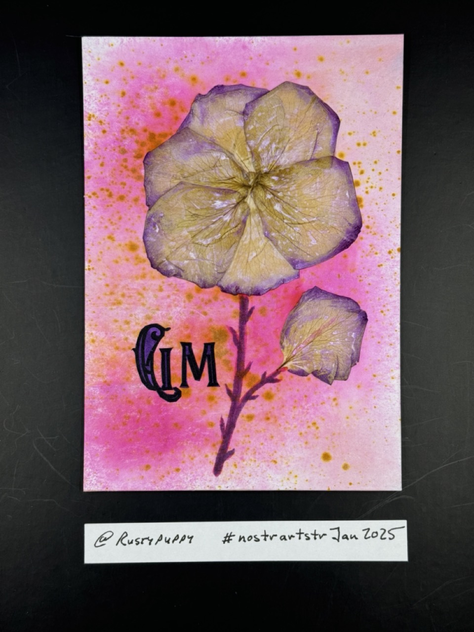
Number 9 - GM to the UTC-5 time zone of New York! This is a mixed media piece I created using pressed rose petals, Distress Ink spray, and liquid acrylic ink. #nostrartstrJan2025 #artchallenge #art #artstr #mixedmediaart #rustypuppyart #gm #nostronly
01/21/2025 17:17 Public
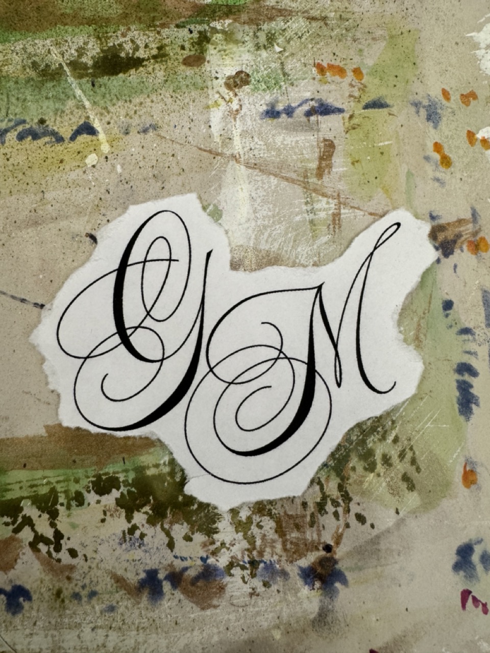
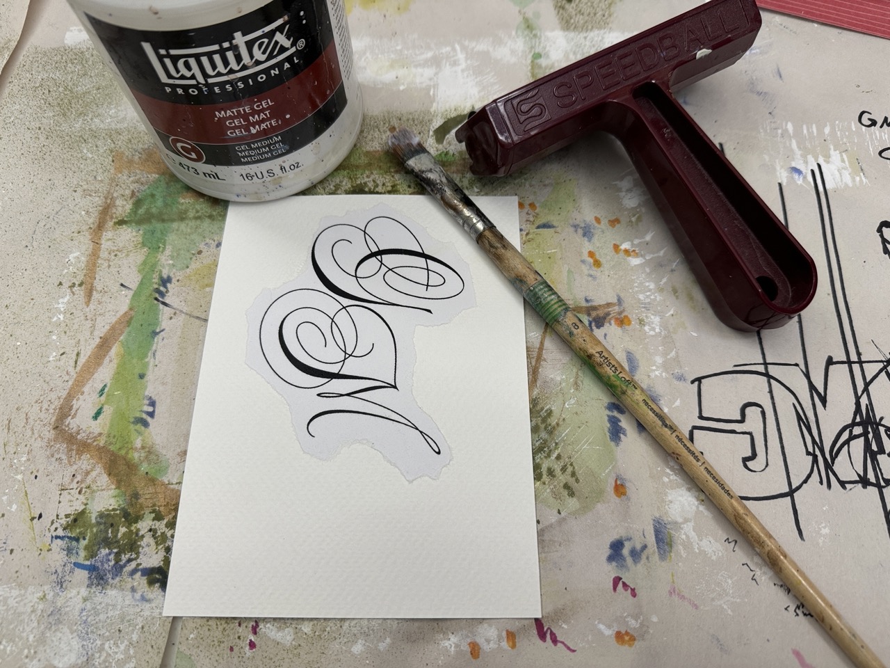
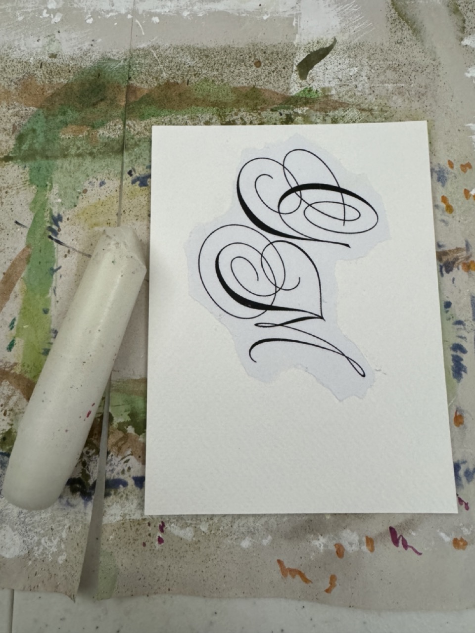
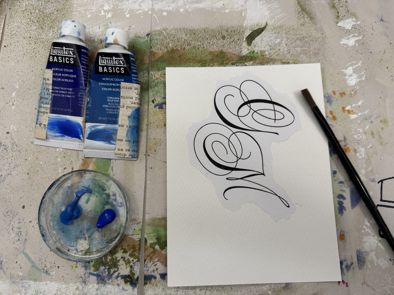
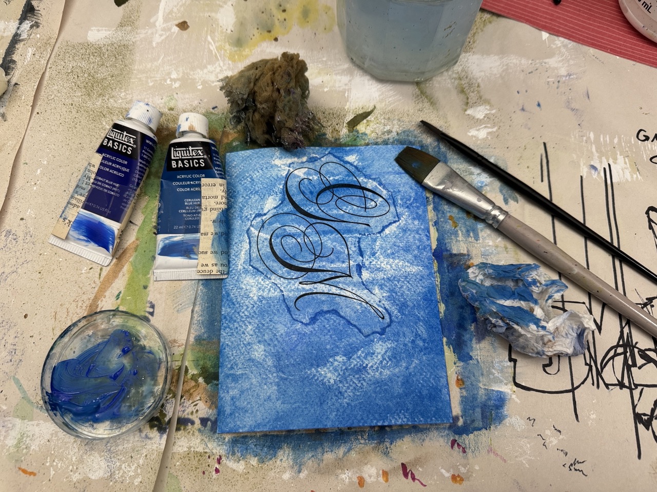
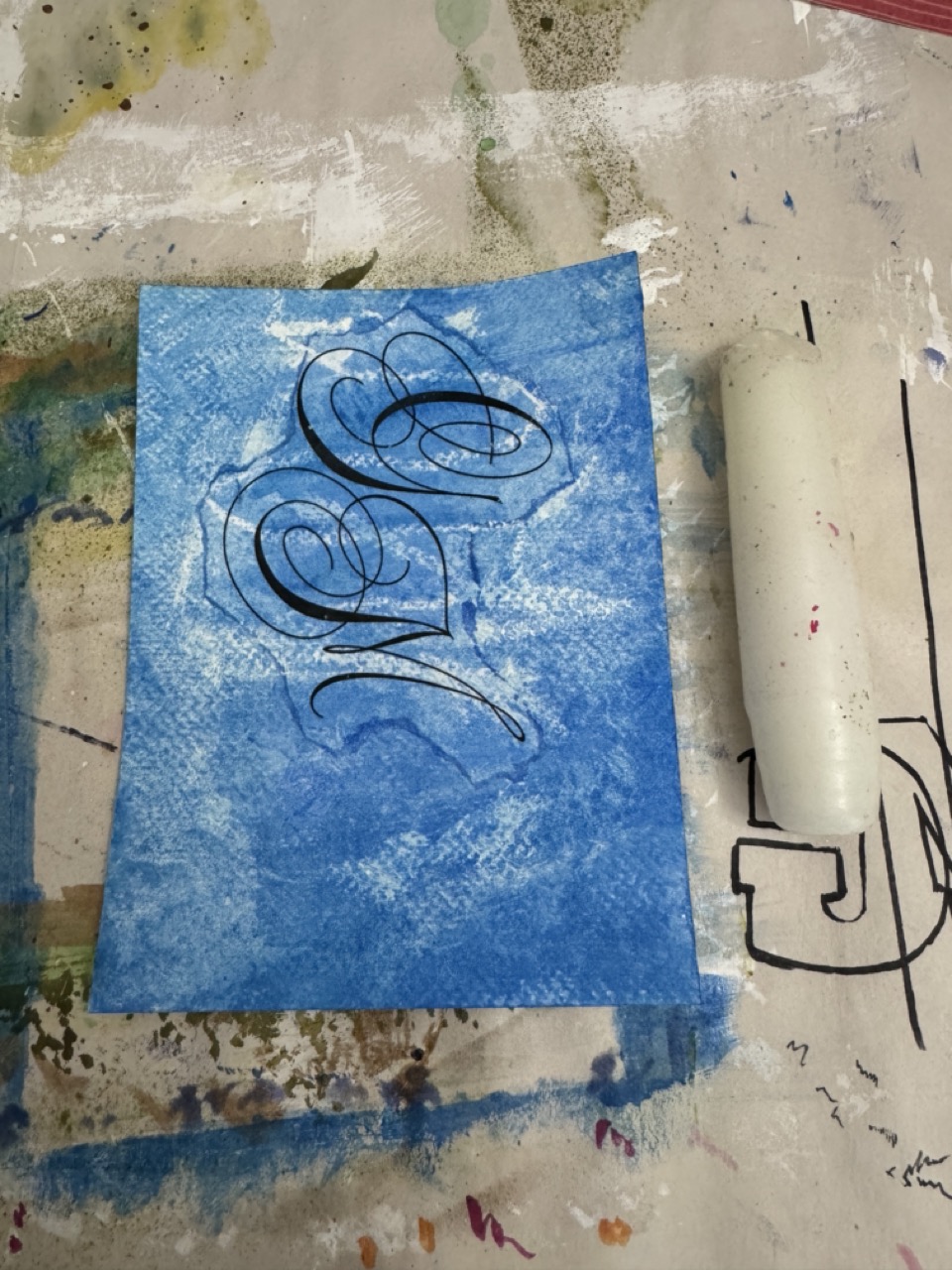
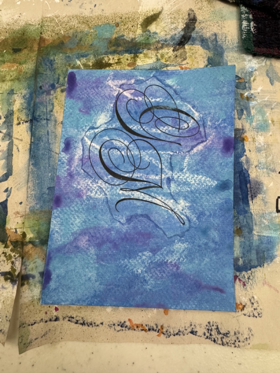
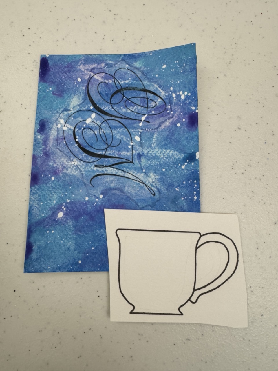
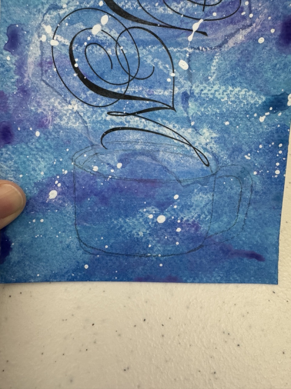
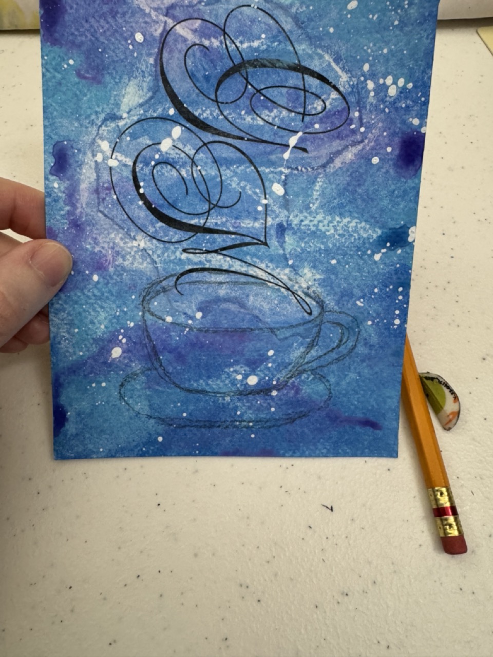
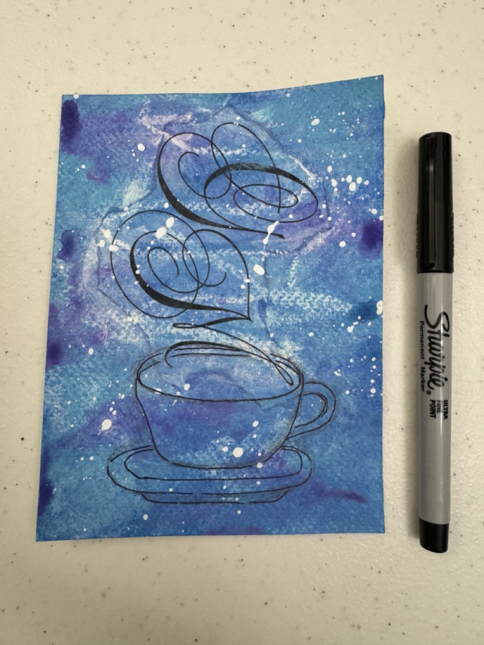
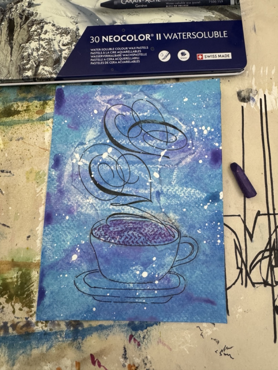
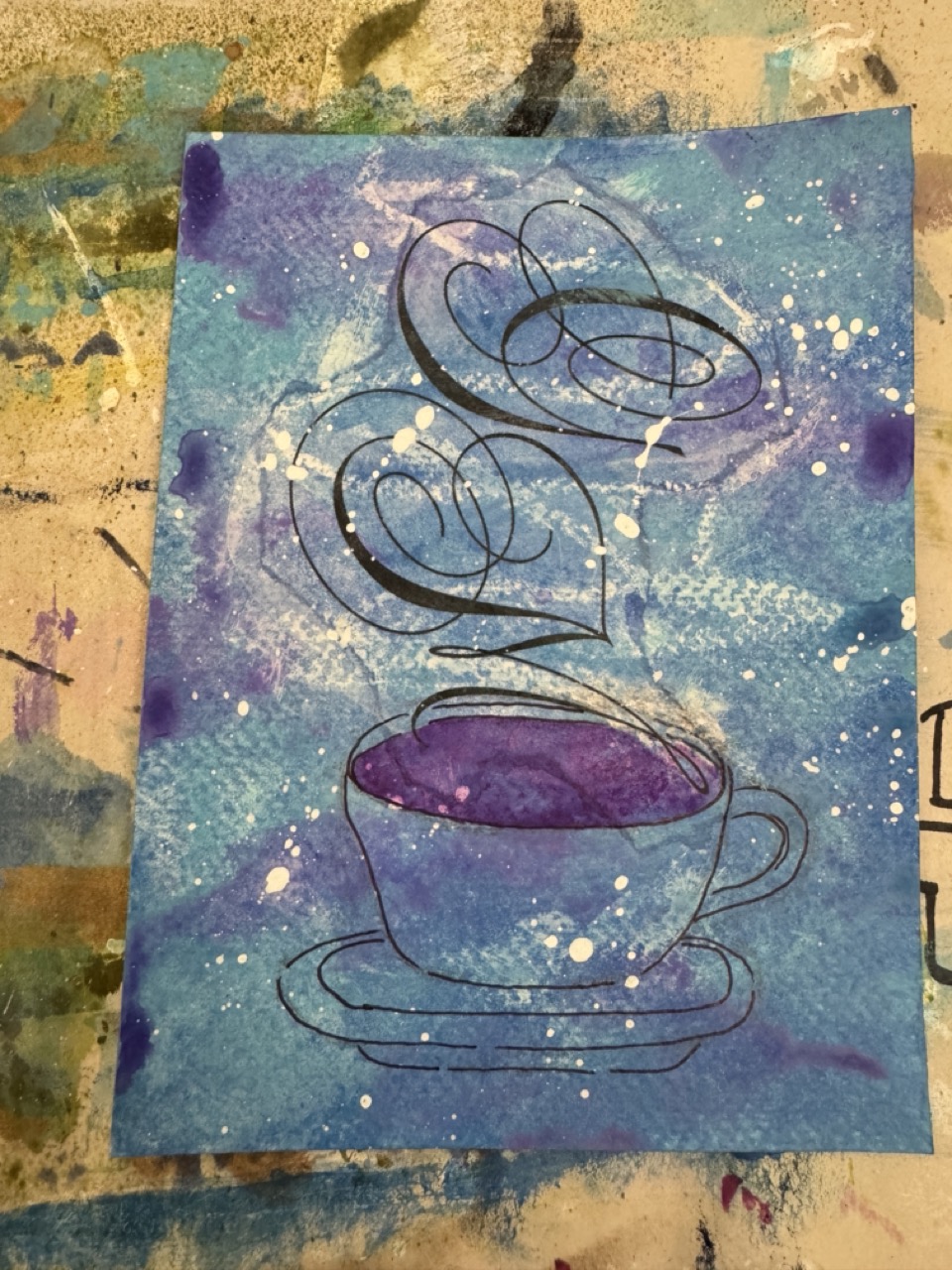
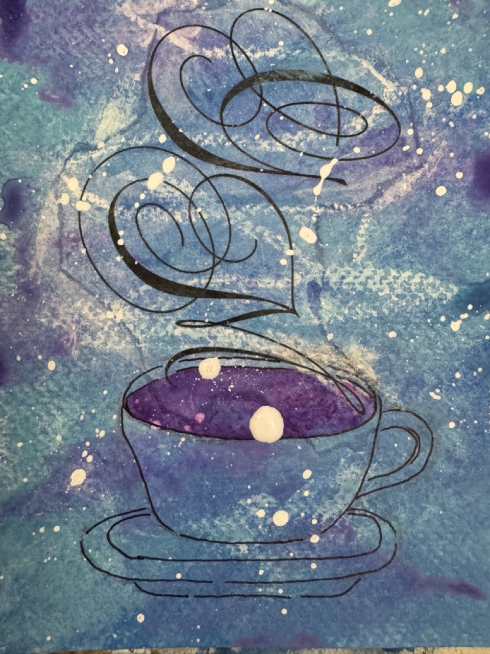
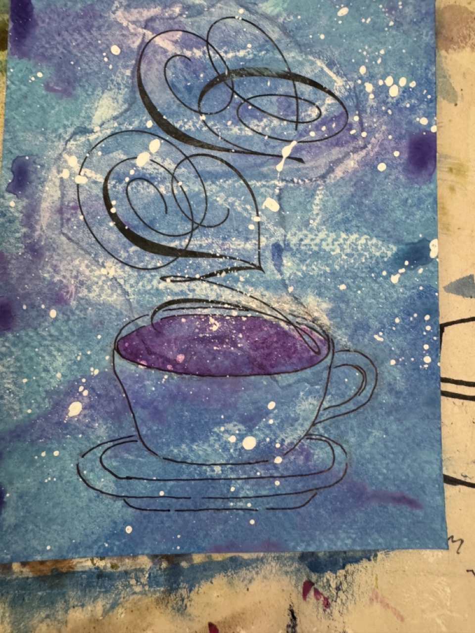
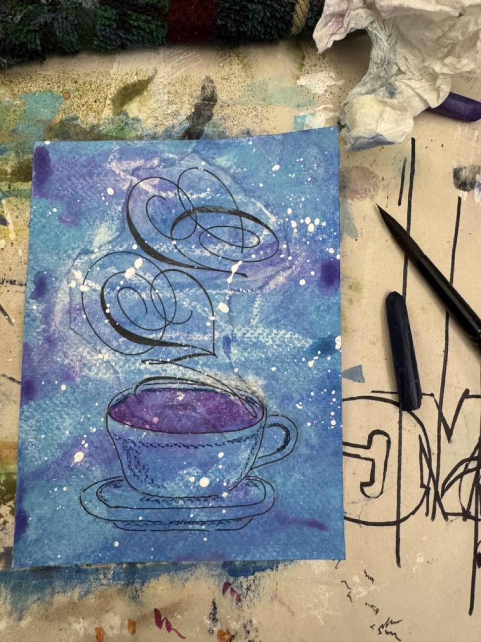
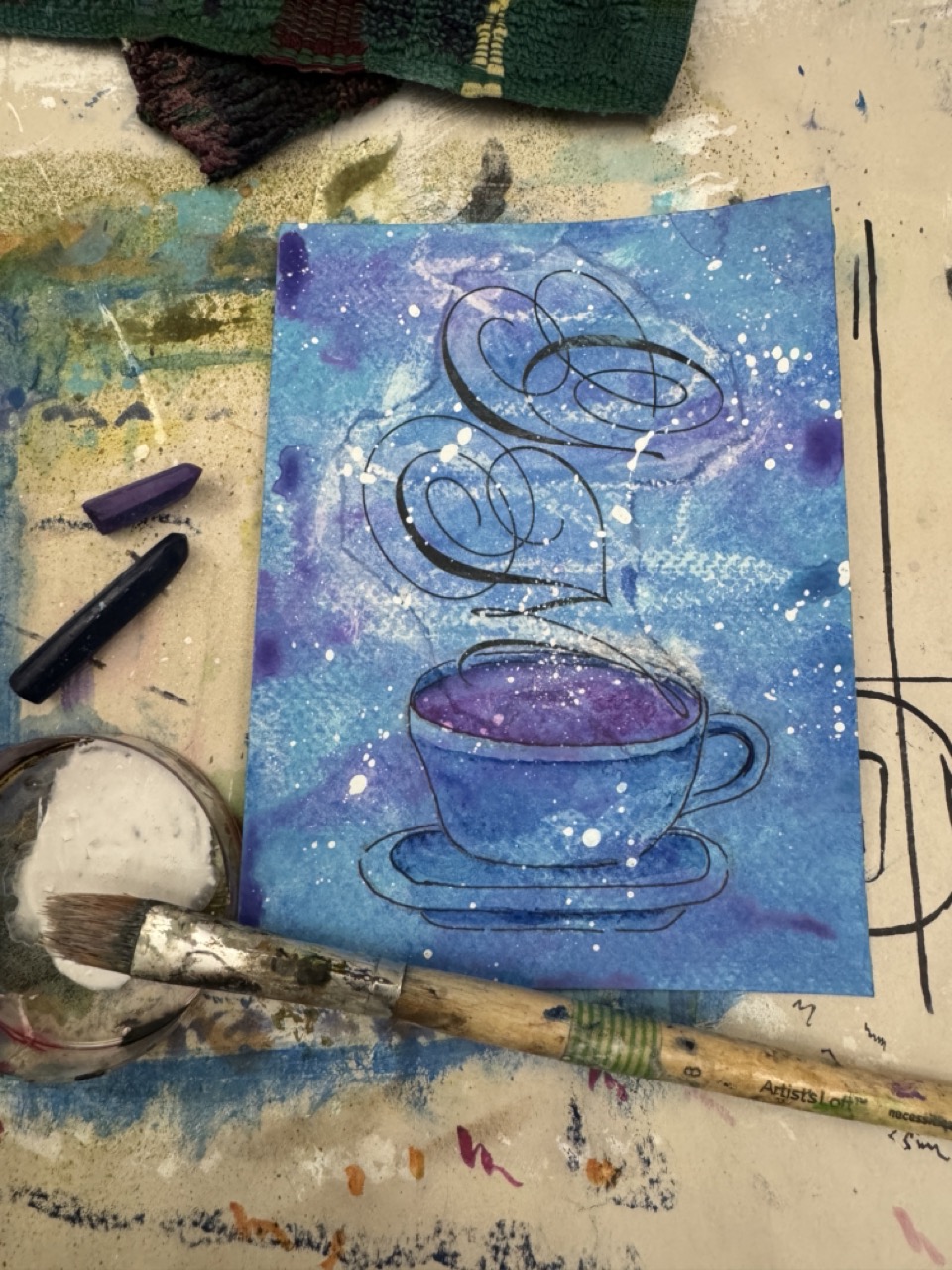
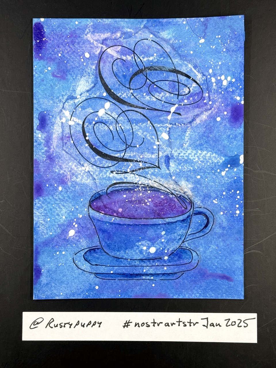
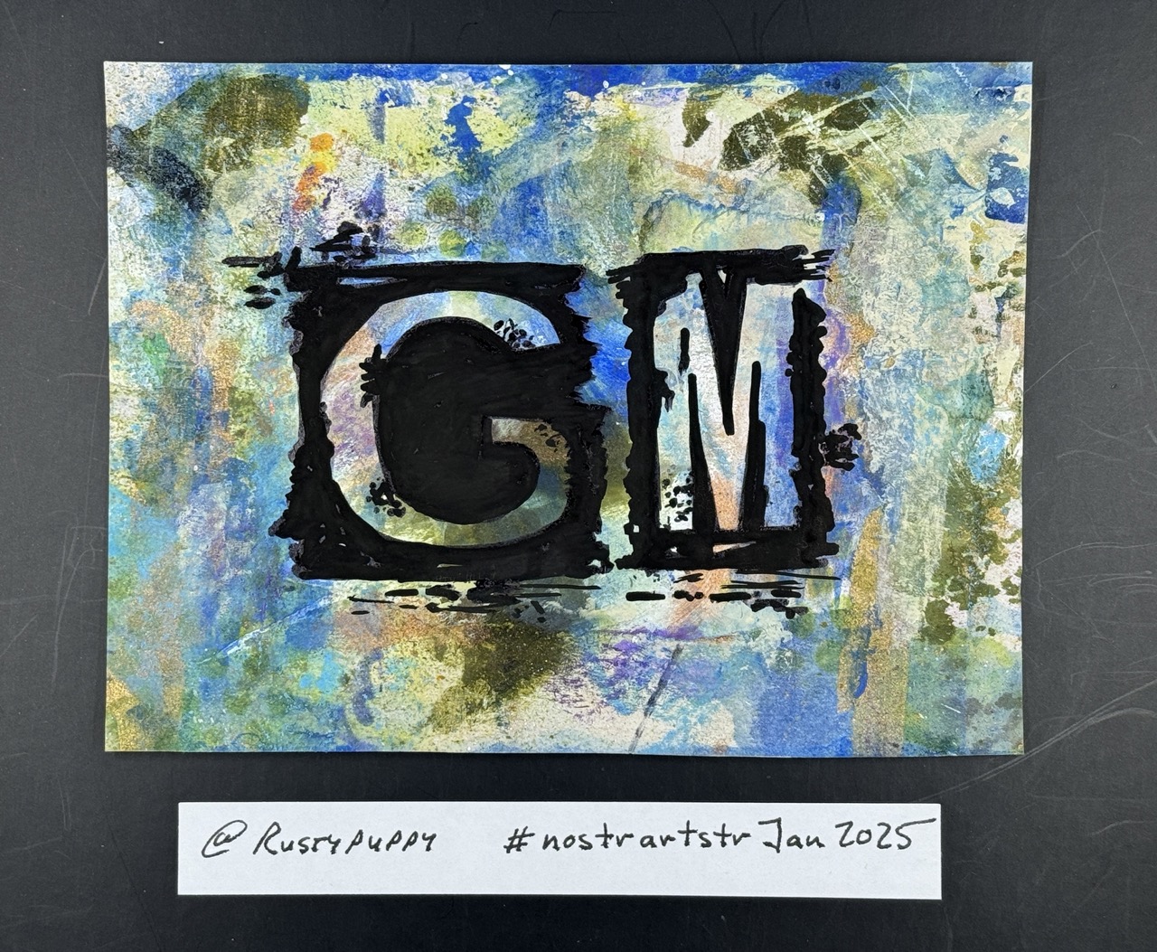
I'm making this process note Public as an example of the kind of notes you get as a Creatr subscriber in January 2025. 8 of 24 - GM PROCESS .... #nostrartstrJan2025 Loved this fancy font GM and wanted to use it more as a design element than text. First I tore the edges and glued the GM to my base paper with matte gel medium. Also gave it a few hard rolls with the brayer to make sure every part of the GM paper was blued down. Next I scribbled over the GM with a white candle. The wax in the candle is going to act like a resist which (crossed-fingers) will create a cool effect when I add the other layers. I had a few tubes of blue acrylic paints I wanted to sue up. so I brushed them on top of the GM. Used a sponge and paper towel to add some texture, and while the wax resist did work, I wanted it to stand out more. In order to make something stand out or "pop," you add contrast beside it. In this case, I added more candle strokes, a dark blue and purple Neocolor II crayons, then activated the crayons with a light brush of water. Given the look of the piece at this point, I also added some white acrylic paint splatters. Next up is the cup to give the GM "steam" a source. I had a leftover from an art project I did years ago (teacup t-rex) but it was too large. Using it as a rough reference, I sketched in a cut with pencil ... and wished, for a moment, that I was working digitally because it was in the wrong spot. So I had to use the IRL version of copy/cut/paste which is erase/redraw, now with saucer. I used a Sharpie fine point pen for the outline and gently erased the pencil sketch. For the actual beverage, I rubbed on some of the same dark purple Neocolor II I used on the background, as I wanted to keep a limited color palette. A tiny bit of water brushed the purple into a liquid to fill the interior of the cup. I tried to add some splatter and ended up with two large blobs right on the cup - splattering is always a bit nerve wracking as you can "mess up" something that you may, or may not, be able to recover. I was able to remove the white blobs (yay!) and added a tiny spritz of white in the center to direct the eye upward to the steam letter GM. Also added a bit of shadow with the dark blue Neocolor II crayon, and smoothened it out with a bit of water. Thanks! - Rustypuppy, host of the NostrArtstr Art Challenges